Redmond Life
How mobile-first design increased sales by 5%

Skills
User interface design
User experience design
Interaction design
Team
2 UX/UI designers
3 Full-stack web developers
1 Project manager
2 Photographers
2 Videographers
1 Brand manager
1 Email marketer
Timeline
February 2022 - January 2025
Made with
Figma
Adobe Illustrator
Challenge
Redmond Life's website aims to inspire intentional living through simple, clean, real ingredients from their unrefined mined salt. However, the site hadn't undergone interface updates for years and was initially designed with a desktop-first approach.
This poor mobile experience caused a significant drop-off in mobile traffic, despite mobile users representing over 70% of their active audience.
Additionally, the site's information architecture had become outdated. As new products and pages were added, the lack of a clear categorical structure resulted in disorganized content placement and an illogical site structure.
Status quo
Here are a couple of snapshots of some pages before the redesign.


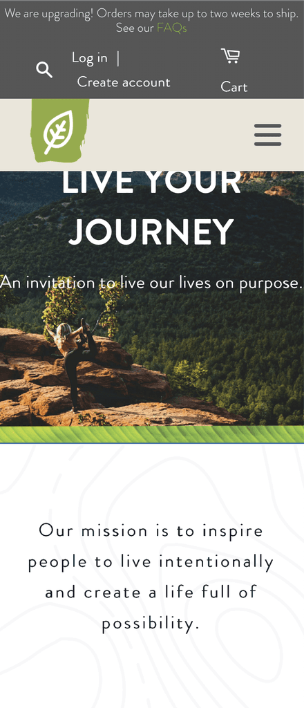


As you have probably noticed, most of the elements are not adapted properly for mobile view. The heavy use of blocks with solid colors attracts attention to the wrong elements, white text over white images proves difficult for legibility as well as utilizing excessive amounts of text where the use of an image or graphic could help make the content more interesting.
Prioritizing mobile-first design
Given the fact that most of the internet traffic is mobile, it was a no brainer for me to begin the redesign of the website on a mobile-first approach. This led to an improvement on the desktop design of the content, which gave the developers an easier time with translating the design to code.
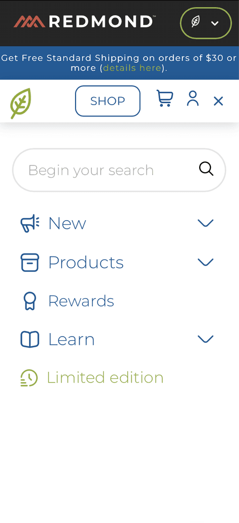
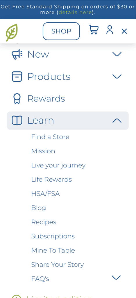
Where to reflect the changes
For the team to know if the redesign of the interface is obtaining responses from users, we selected the pages with most visits in order to present the new changes. The pages to receive the design update were the blog page, a product page as well as the checkout pages and home page.
Building the design system
As the redesign of the site expanded on current and new pages, I began to create components moving forward with the project. This allowed me to set a standard across the entire site in terms of design, without setting aside how accessible the redesign was becoming. When new designers were added to the team, it resulted in a seamless page-building experience with little to no questions about button colors, heading sizes or card anatomy.


Impact
Three months after implementing the redesign, the site metrics showed significant positive impacts. The checkout redesign led to a substantial decrease in customer service calls related to order placement.
Usability testing revealed users could complete tasks with fewer clicks, demonstrating improved navigation efficiency. Most notably, mobile engagement increased dramatically following our mobile-first approach, directly contributing to a measurable boost in sales.
The redesigned website achieved higher accessibility scores during the Redmond Life team's quality control testing.
Learnings
This project marked my first full-time design role and introduced me to cross-functional teamwork. Key learnings include:
Effective communication with non-designers - translating complex design concepts into accessible language for developers, project managers, and stakeholders
Setting realistic expectations - understanding technical constraints and working within project parameters
User-centricity - maintaining focus on user needs throughout both new page creation and redesigns of existing content
Design handoff best practices - creating documentation and specifications that developers could easily implement